User Experience Design Portfolio

UX Case Study
Helpdesk UX Design
MIN-NS is a non-profit organization founded by the local hospitals of Skagit County. In 2016, as part of an ongoing effort to improve user experience, the company decided to create a custom helpdesk.
My Role
I was in charge of the project and the sole UX and UI designer. Specifically, it was my job to:
- Manage the design project
- Conduct necessary research and propose the design plan
- Design the user interface
- Develop the solution
- Test and improve the design going forward
The Challenge
There was no helpdesk. Users would call the mainline and get transferred to the Support Team. The available knowledge base was a mess of disconnected technical articles that collected over time, and nobody had clear access to it anyways. It was time to sort out what was available and what needed to be added, and along the way, create a unified access point for Technical Support.
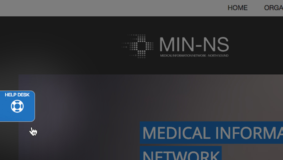
Initially, on the old website the support button led to a static page with a list of phone numbers.
Research
I set out to find out the current user experience. In order to do that, I needed to scan all existing online help and physical copies and guides sent out to users.
Discovering User Journey
I began collecting data on who were the users and how many choices they had to initiate a support session. At first, I gathered the data in a table after interviewing key people at the company.
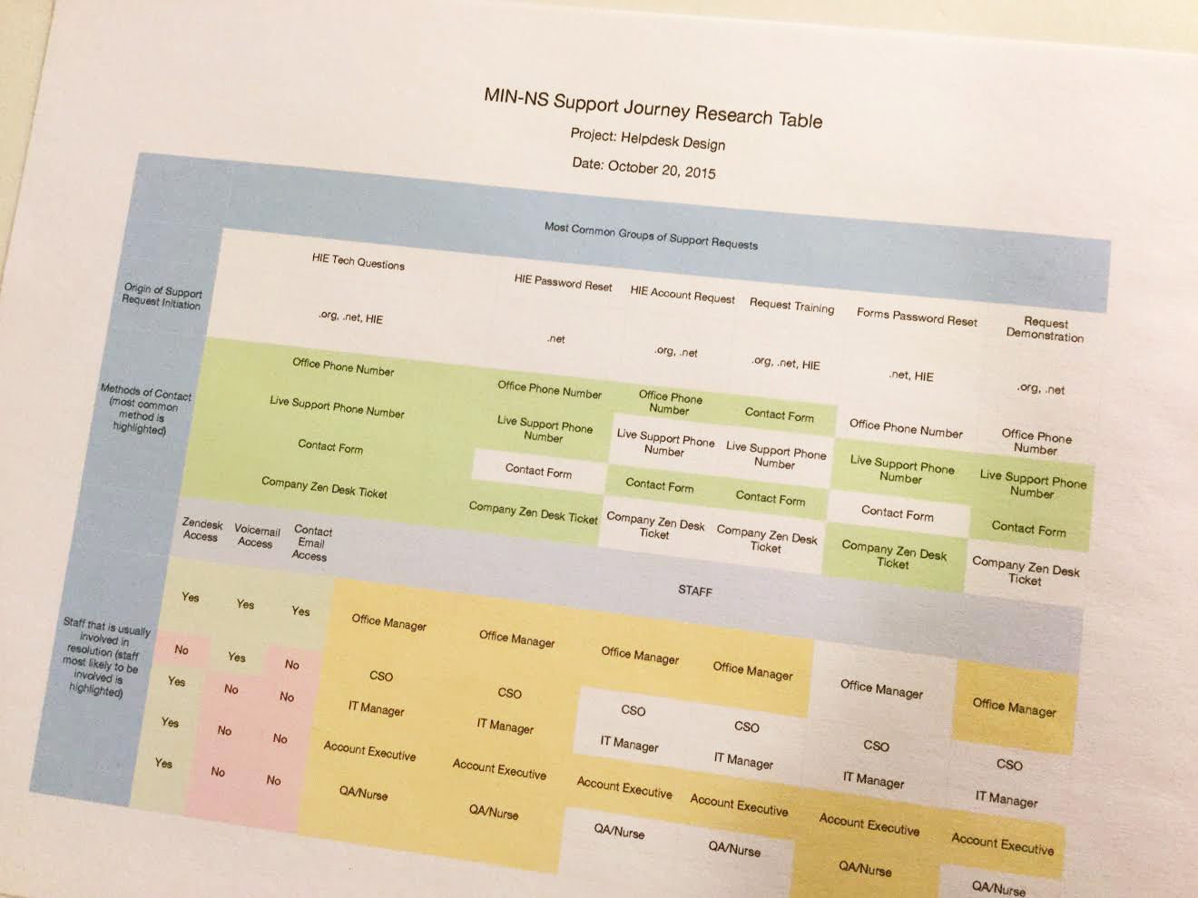
Initial data on the current user support journey
Then, I did some rough sketches of how a user would be channelled through the support funnel.
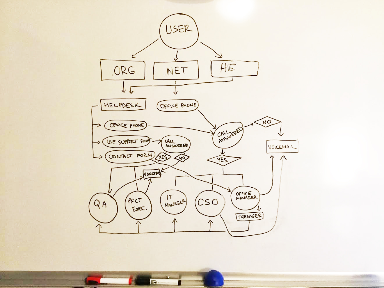
Inital whiteboard sketch of flow diagram.
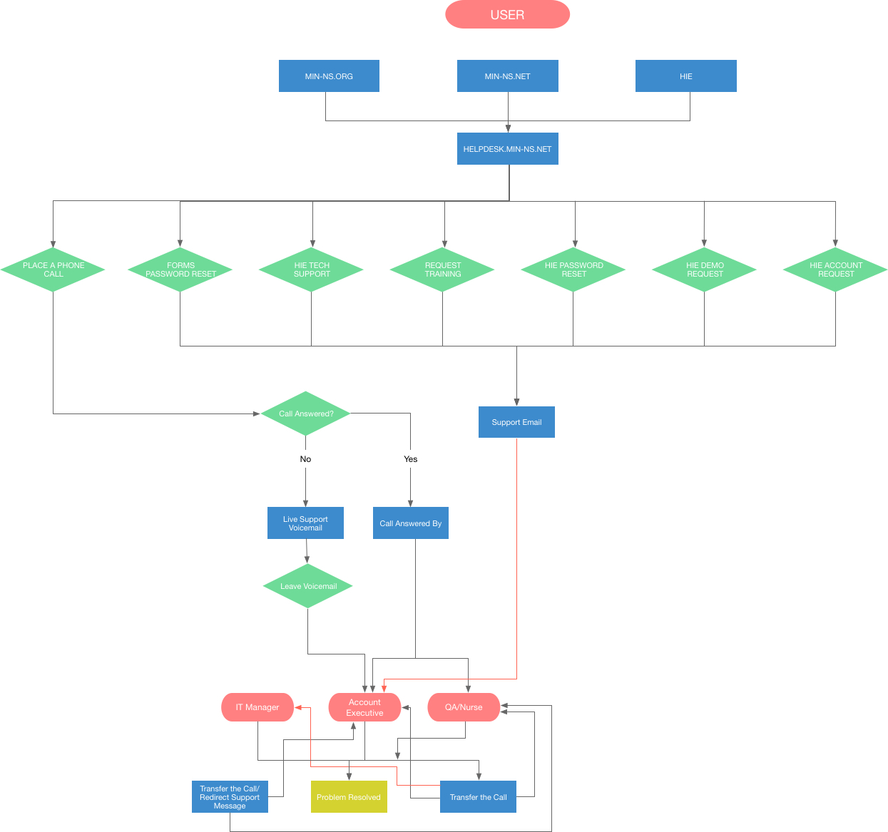
After going through a few of the whiteboard sketches with co-workers, I flushed out a presentable version of the current state of the helpdesk routing. I found out that besides general inquiries, there were 6 types of requests:
- Forms Password Reset
- HIE Tech Support Questions
- Request Training
- HIE Password Reset
- HIE Demo Request
- HIE Account Request
And at the moment, all 6 were routed down the same pipeline.
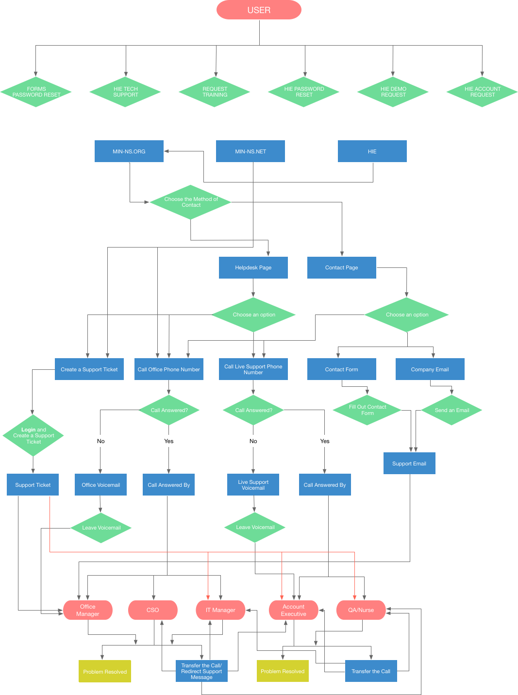
Flow diagram of user journey through helpdesk request.
content Inventory
I also discovered that there was an internal website with articles written as a guide for HIE. I found out that there were no links to it anymore, and that a lot of the content was outdated, but overall it was a good chunk of what we later would call "Knowledge Base". I also took inventory of the content available at the time.
Support Team Interviews
After reviewing the current situation, I set down with key support people to define the goals for the project. Our discussion kept coming back to the same few goals that would increase efficiency and reduce the number of calls we receive.
We have to consolidate access points into one helpdesk."
Following our discussion, I sat down with the CEO to refine and document objectives and goals for the project.
Business Goals
- Reduce amount of calls
- Streamline support for efficiency
- Update and revise content
- Useful helpdesk
Design Goals
- All help in one place
- Simple choices
- Intuitive layout
- Useful knowledge base
Design
With approved, clear goals I began reviewing the available content and spent some time organizing it. At this stage, I worked closely with the support team to sort out the content and draft a plan for creating new content and revising the old.
New User Journey
First of all, I wanted to improve the user journey. I realized that there was no specific reason as to why there were so many funnels. Since the team was open to change, I decided to reduce the funnel to the most minimalistic functioning version. I put together another flow diagram.
Flow diagram of the new user journey.
In this new flow, we reduced the amount of calls and the amount of people involved in the process. Users would still have the option to call, but now were presented with direct contact options for each specific request. All of that would be initially handled by the Account Executive.
Information Architecture
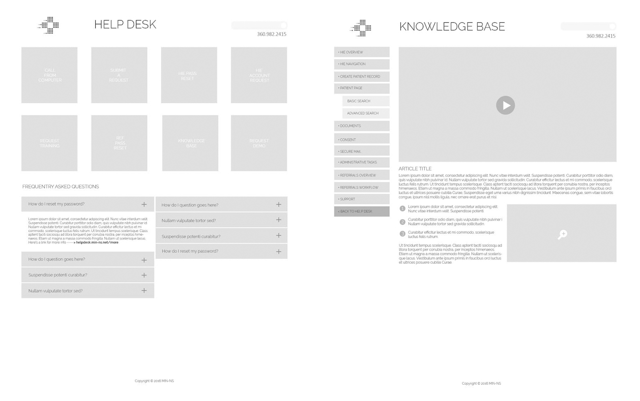
Once we sorted through all the documents, I began laying out the sitemap for the future site. We wanted the front page to contain access to the most inquired support requests. Knowledge base would be integrated into helpdesk.
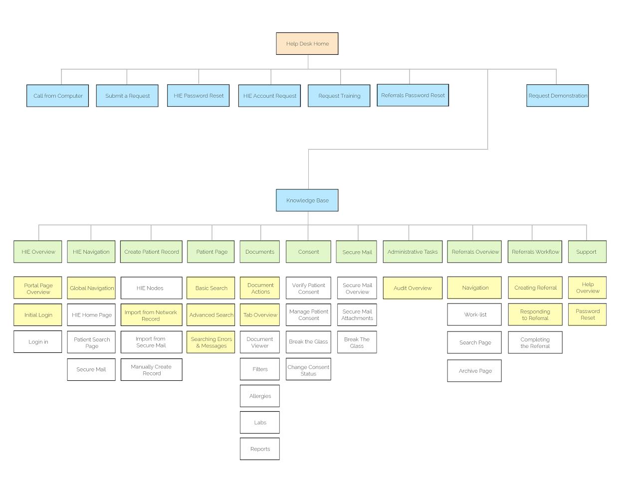
The approved sitemap design for the new helpdesk.
Along the way, the CEO requested to add the option of initiating a call from within the website. This would mean that a user doesn't have to make the call, but rather provide the phone number in a popup box and the program would place a call to the support team from the users phone.
Wireframes
At this point it was time to sketch out a few different ideas for the Help Desk layout. I wanted to make sure that it was simple and to the point. As the user lands on the helpdesk homepage, they should, within a second be able to pick the option they're looking for.
Here are some of the sketches that led the way to the final chosen design which incorporated the option on the right, because it provided a full array of options without being too cluttered.
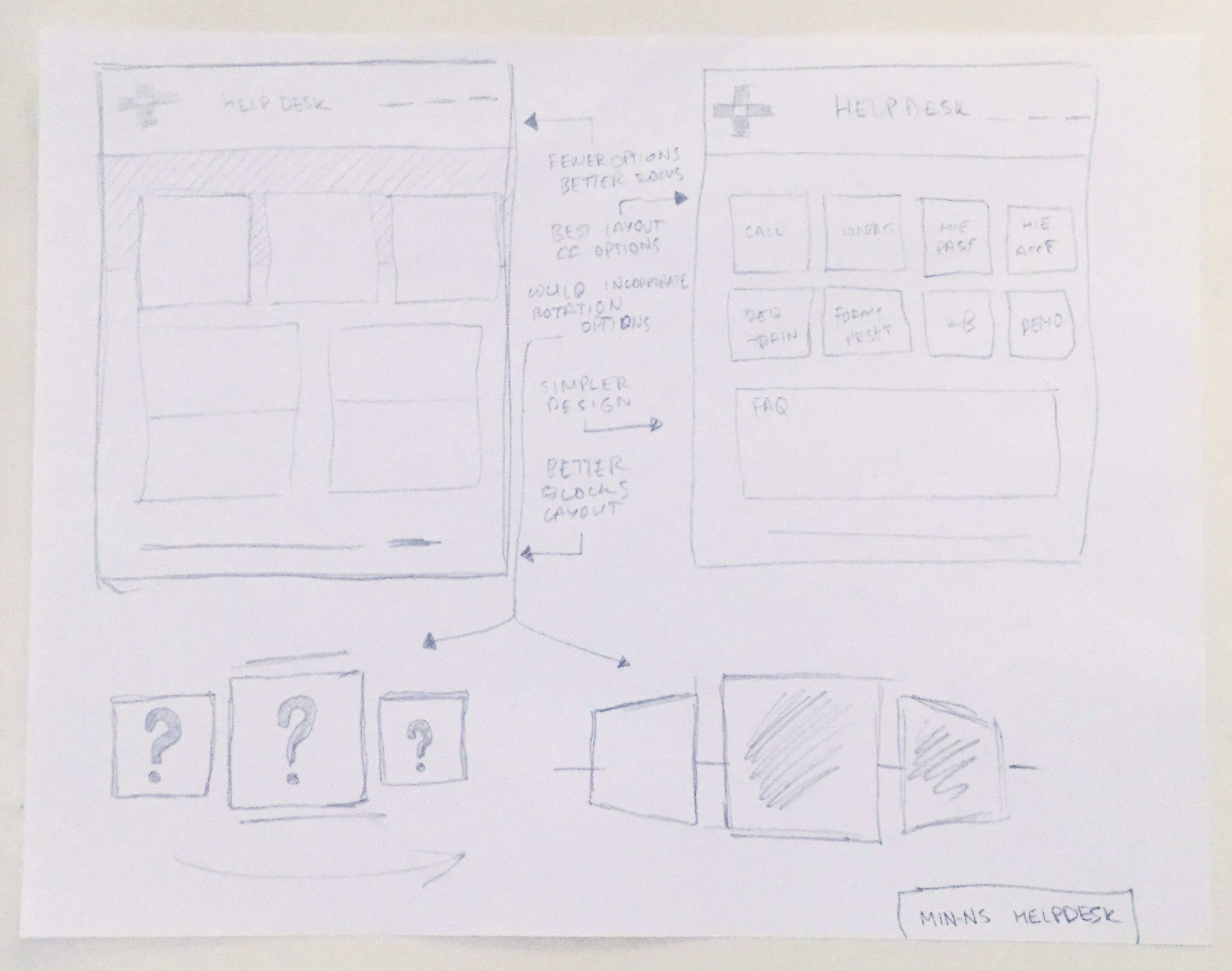
Wireframe sketches of the new Helpdesk layout.
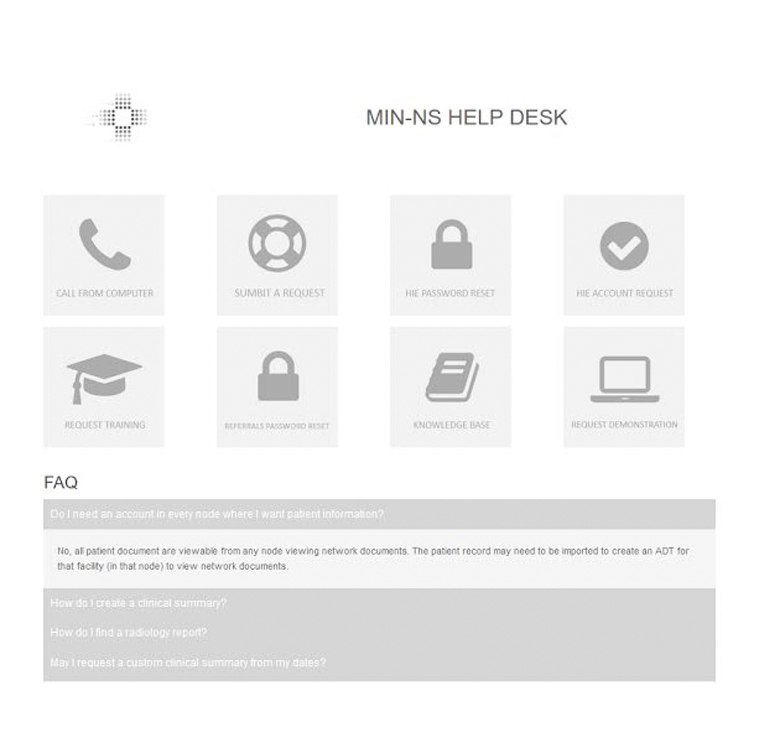
To make the sketches presentable for discussion, I quickly put together wireframes in Balsamiq. We used these as reference in our next meeting. Initially, the design included videos for several key entries in the Knowledge Base, but later during post-production of the videos, the project was halted and never resumed.
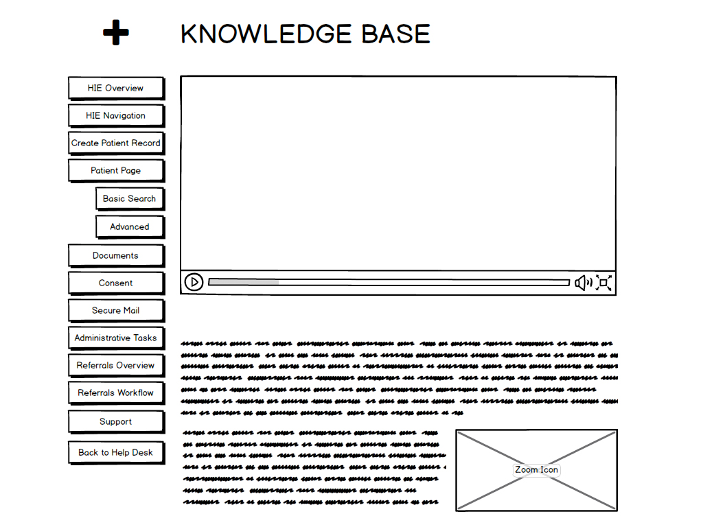
Quick wireframe prototype in Balsamiq.
As the project progressed, I created more refined wireframes with proportional layout and proper sizes of elements for all the pages.
Refined wireframes of Helpdesk.
Since I would also be the developer for the project, I created high fidelity wireframes. In this one, I added "Font Awesome" icons to each of the tiles on the home page. The graphics are very light on load, and great for connecting the words with a picture.
High fidelity wireframe of Helpdesk.
The final stage of design was to add corporate branding to the UI. Then it was time to implement the design and make it real.
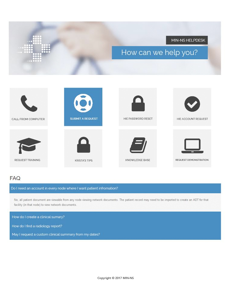
UI Design of Helpdesk.
Development
This project had the technical requirements to be developed on .NET platform, and Umbraco was the organization's preferred CMS. Since by this time I already completed a website redesign project with Umbraco, I had a pretty good idea of what to do next.
The biggest challenge came when I was asked to write a tile highlight based on the set of IPs that we acquired from our main user centers.
The rest was pure HMTL, CSS, JavaScript, jQuery in a few places and plenty of Razor.
Finally, I redirected all previous support links to the new helpdesk, and hosted it conveniently under "helpdesk" subdomain.
UX Success
The new Helpdesk received a positive review from both team members and our users. It became much easier to find help and users were able to file their requests much faster. More importantly, it reduced the amount of call transfers. As a result the organization saw:
- Decreased amount of calls to our support team
- Increased amount of text based filed tickets
- Multiple positive feedback from users
- Decreased amount of web related tech support calls
Click here to check out the helpdesk project. Please keep in mind some aspects of the design might have been altered or changed over the years.